
Reshaping of
Europace products design language
@Europace 2022
Role
Lead UI Designer
Challenge
Redesigning the Interfaces of Europaces after the Brand relaunch
The Mission
Setting up the overall design language for Europace Products together with simple rule sets and the following up design system to enable other product designers to produce product interfaces that Europace customers would love to use. Both on b2b and b2c side.
Setup
Creative Director from Brand
Lead UI Design from Product Experience <-(Hey, that's me)
Lead UX from Product Experience
Identifying the current state
A 20-year-old, decentralized, multi-product company has developed quite a few different solutions over time. to get an overview of what we need in terms of components, styles, and/or possible themes, all interfaces and developed live versions were collected together with the product teams.

Creating the Northstar with product design principles
A vision workshop was organized to find out where we are, where we want to go and what vision we are pursuing. The brand design lead, UI lead and other product design roles from the individual product teams took part.
Based on the overarching product principles, specific product design principles were developed which were to serve as guidelines for all subsequent design decisions.

Finding Foundations
Based on the product design principles, another workshop was organized during the rebranding process, in collaboration with the brand team. The goal was to further streamline the brand and product, setting the initial fundamental design decisions for the product landscape. This aimed to unify the requirements between brand and product, thereby developing scalable foundations that would withstand later systematization.
Refining the Design Language for the products with UI mood boards and proof of concept key screens
In close cooperation with the brand design team, the first UI mood boards and key screens were produced based on the previous workshops to develop the general look and feel. The first design decisions were made which would form the basis for the subsequent design system
Differencing B2B and B2C
The main brand colors that have emerged from the rebranding are teal and purple. Yellow can be used as a disruptive color.
The challenge of addressing two different target groups in our product world was solved with the help of different main colors. For the B2B sector, we opted for the set "Teal 700". Working people who would spend several hours a day working with the Europace platform should be confronted with a calm main color so that they can concentrate on the essentials.
In the B2B area, "Purple 700" was chosen. The color choice should emotionally appeal to the end customers.
In both cases, the darker and warmer variant was chosen to communicate the necessary seriousness to users, which it should bring for a construction financing project.

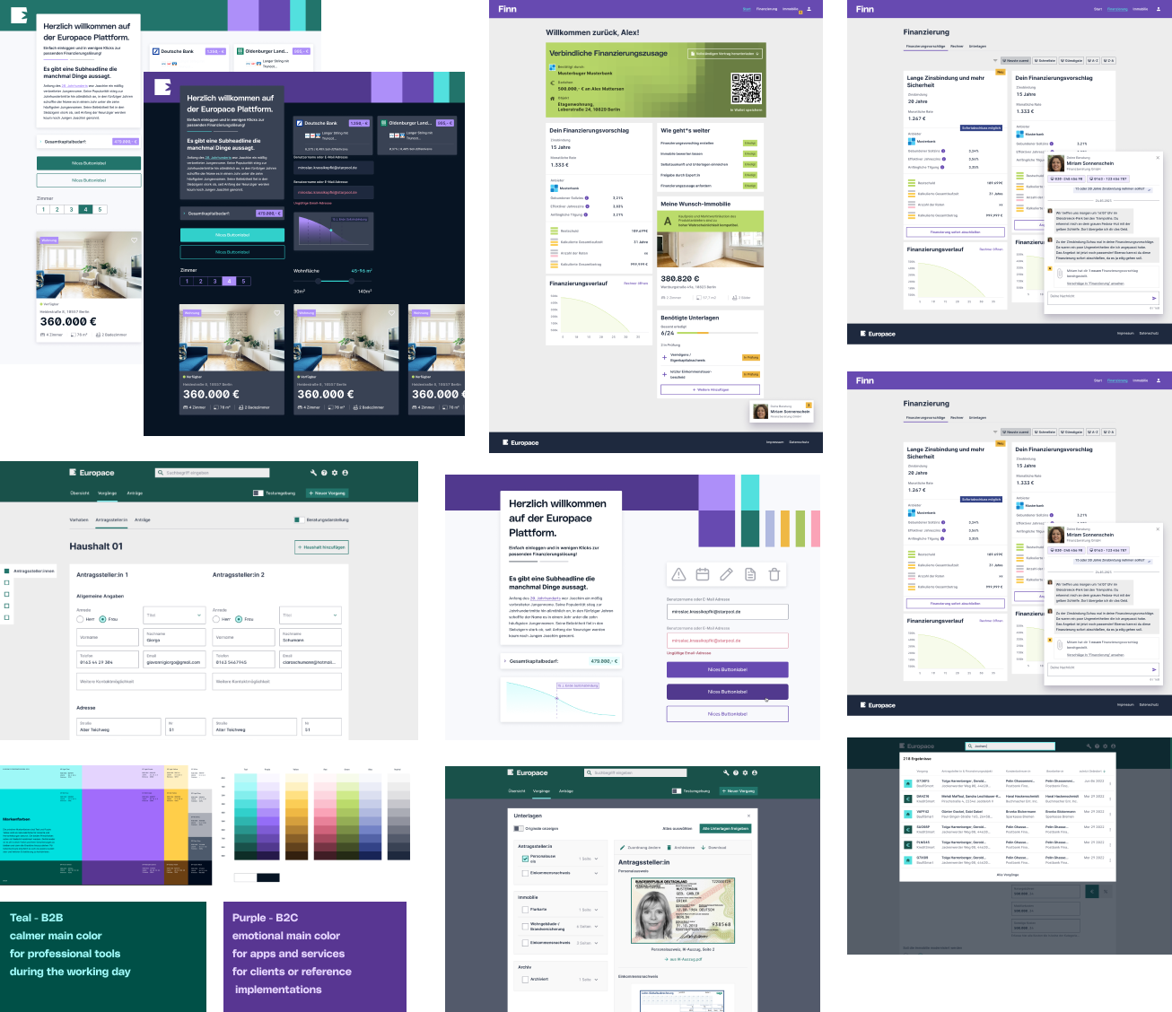
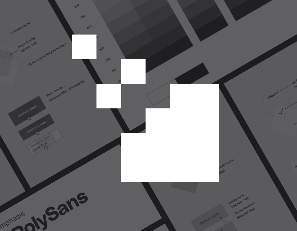
Typography
Europace uses two fonts to match its brand and functionality needs. "EP Poly Sans" is mainly for display and emphasis, known for its unique style and strong presence in headlines. "Inter" is used for everything else, chosen for its clarity and screen-friendly design. It's used in medium to bold weights to keep the brand's bold, approachable feel.
In designs, left-aligned text is preferred for clarity, with other alignments used only when necessary. For the financial platform, readable and distinct numbers are crucial. Features like tabular numbers slashed zeros, and open digits ensure numbers are clear and easy to read.
Lastly, the approach to text is user-friendly, avoiding small caps and all-capital words to keep text readable and approachable, reflecting Europace's respectful brand voice.
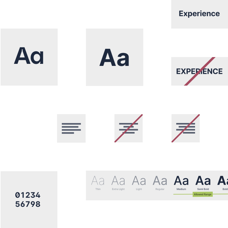
The square as a basic building block
Europace's visual brand language is based on a square grid system and the use of rounded corners and circular elements is avoided across the board in marketing materials. This is reflected in the product by not using border-radius values in UI elements.
However, here too, form follows function. User tests showed that users were sometimes unable to distinguish between a chip and a button. Similar phenomena were observed with the switch component. In these cases, the rules were deliberately broken to ensure the best possible user experience.
Collaboration with Pilot teams
Two teams were identified that were in the process of developing new products. The team was supported in the design process. We worked closely with the product trio.
Inconsistencies or weaknesses in the design were uncovered during implementation and could be improved. Requirements for design roles in the design system and the communication of design guides were also collected and incorporated into the documentation accordingly.


Enable other design roles
Figma libraries, style guides, and the styles section for the design system documentation were created to support design roles in making their design decisions independently. There was also a close exchange with the design roles of other project teams to mentor and support them.
Here, attention was not only paid within the project teams to enabling people individually and for themselves but a focus was also placed on promoting multidisciplinary exchange between the design roles. To this end, community syncs were established every two weeks. Alternating and randomly selected cross-team feedback partners were also introduced.
If questions remain unanswered, asynchronous contact channels via Slack are open at all times.
Let's talk about it.
If you have any feedback, questions, or any type of input: don't hesitate to get in contact with me.
Selected Works
Experience - Europace DesignsystemDesign System for a multi product company
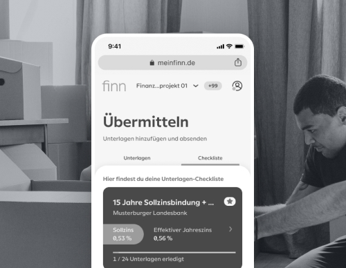
FinnHelping consumers to better understand their real estate financing

LocalBrandingReshaping the agency brand and product line

AOK NordostRewarding health insurance clients for a healthy, active and social lifestyle

AllSecur x AllianzRewarding car insurance clients for driving safely